 |
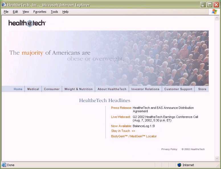
Old index.jsp page. Had 4
Flash files, which played consecutively. Each file ranged from 750K to
1.5 MB. There was a Flash detect page that was 1.5 MB itself. All menus
were done with graphics. These graphics and all navigation for the site
loaded upon your first visit to the index page, for a total load of 6
MB. |
 |
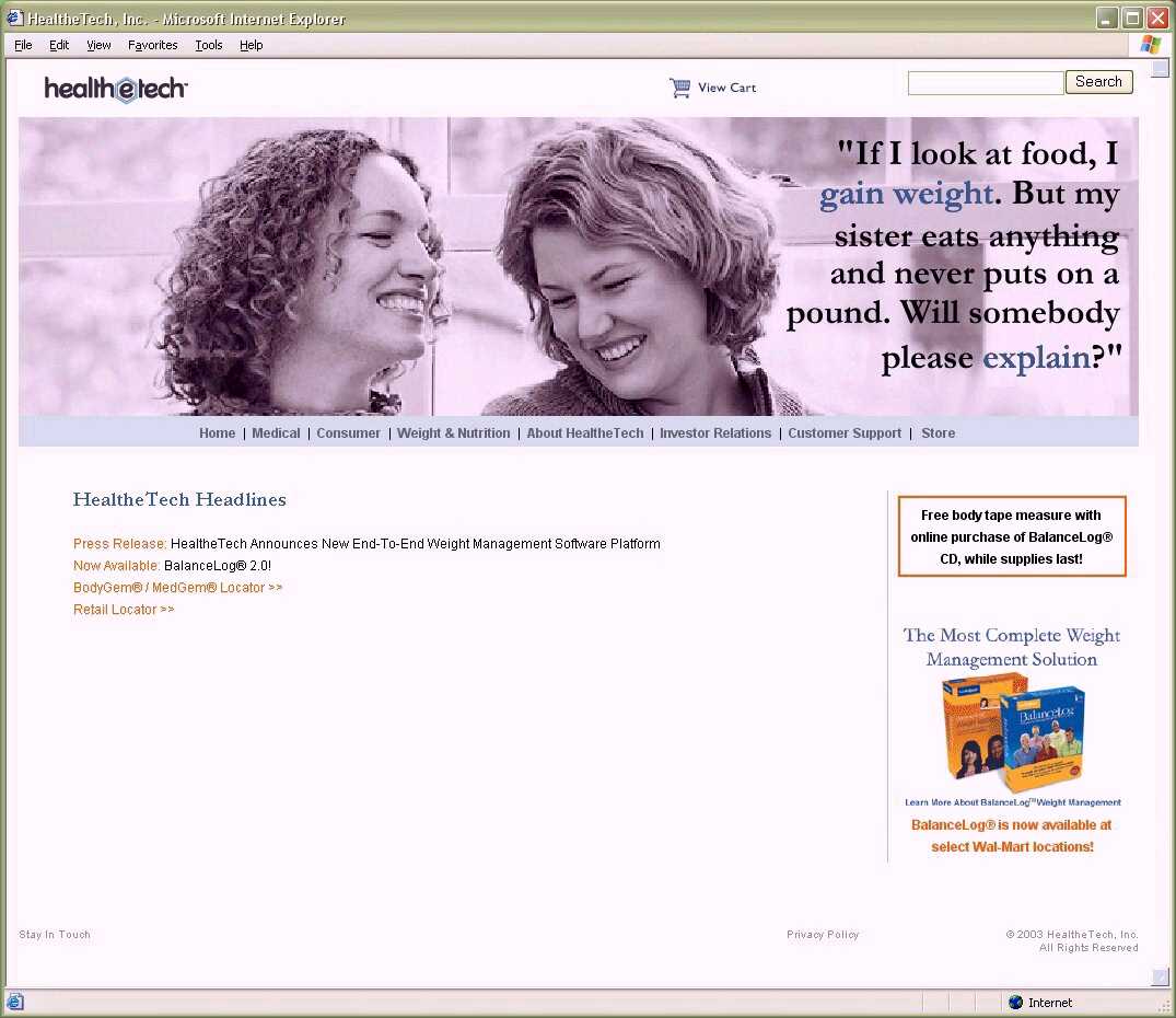
New index.html page. All Flash
removed from the site, since 50% of total site users were on AOL and 85%
of total site users were on dial up (AOLers included). Has rotating
static clips from the previous ad. Has vertical branding element that
allows specials on products to display throughout the site. Added site
search capability and shopping cart. All elements within the site are
done with server side includes, so that menus and other elements are
reused and require little effort to change. Site also uses cascading
style sheet (CSS). |
 |
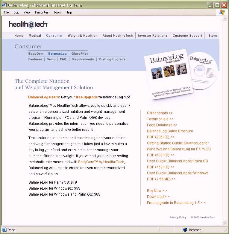
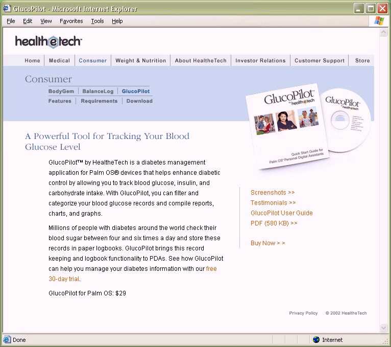
Old product page. Inconsistent
navigation; purchasing the product was three clicks away. As with all
menu items, could not tell if a page had been visited or not. |
 |
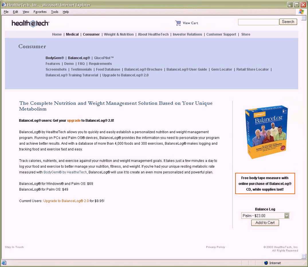
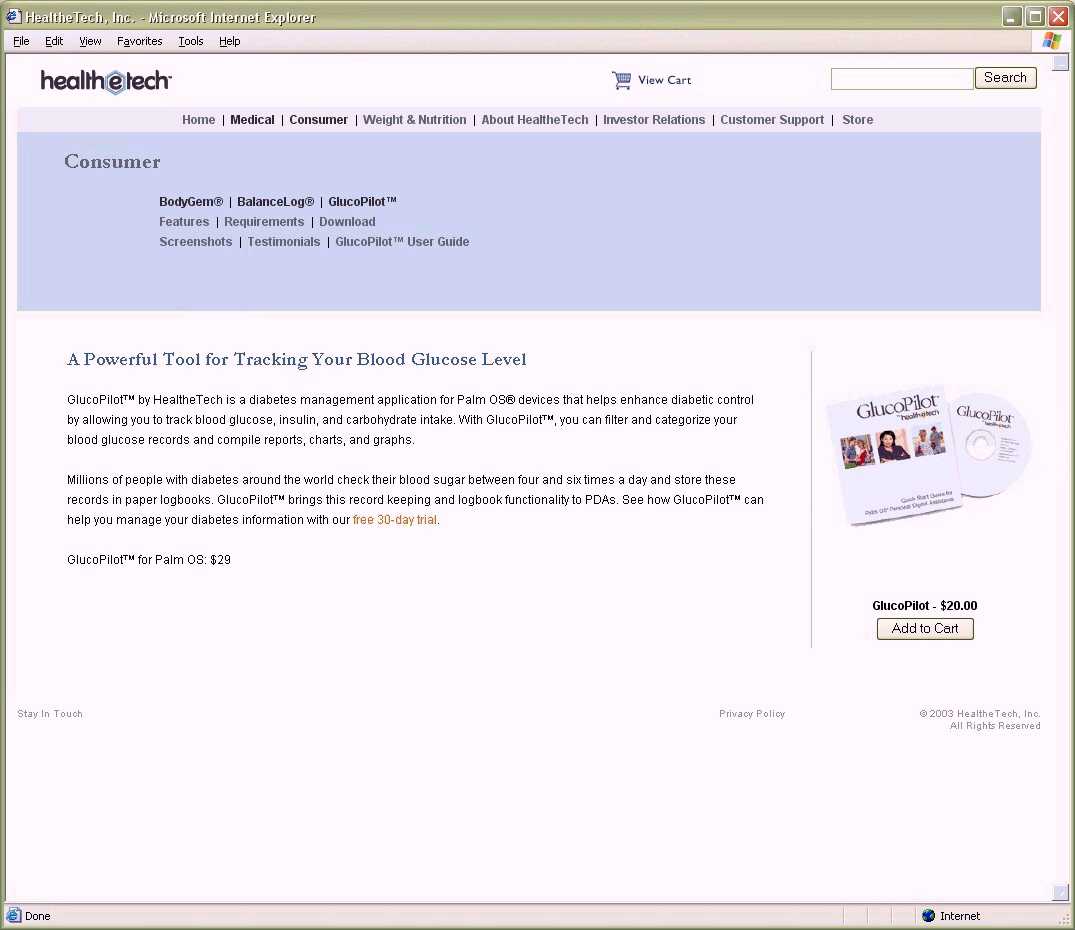
New product page. Consistent
navigation, product can be added to cart with one click. Consistent
vertical branding element so that all sections feature their correct
product consistently. Also reduces time to maintain. Navigation is
sufficiently clear and color coded so that you can see if a page has
been visited before or not. This aids the user in locating information
and not re-visiting already-viewed pages. |
 |
Old product page. Inconsistent
navigation; purchasing the product was three clicks away. |
 |
New product page. Consistent
navigation, product can be added to cart with one click. Consistent
vertical branding element so that all sections feature their correct
product consistently. Also reduces time to maintain. Site header and
footer information is now consistent through every page. It is no longer
graphical, either. |
 |
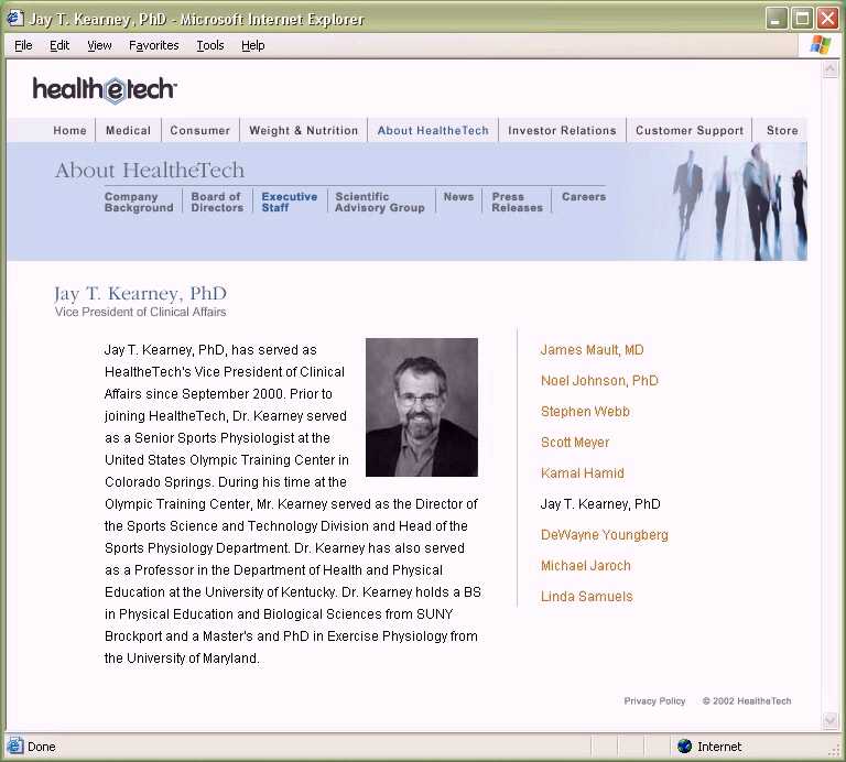
Old executive information
page. Inconsistent navigation. |
 |
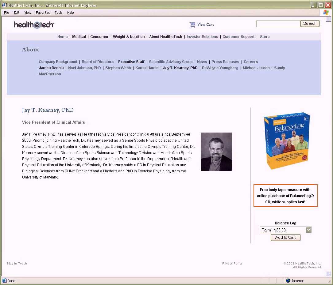
New executive information
page. Navigation is now consistent and will come up correctly in site
searches. I had wanted to relegate such non-revenue producing pages to a
section accessed by a small text link at the bottom of the site, in the
manner that amazon.com does it. On this, I was overruled. But I
introduced a vertical branding element nonetheless so that the product
is never more than a click away from the user purchasing it. Real estate
is valuable; no opportunities to sell should be lost. |
 |
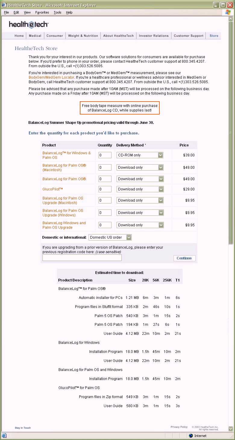
Old store page. Long,
text-based, and difficult to find the product or the options that go
with it. There was a laundry list of product and download times that the
CFO insisted I place at the bottom. This is probably the worst shopping
cart page in the history of e-commerce. |
 |
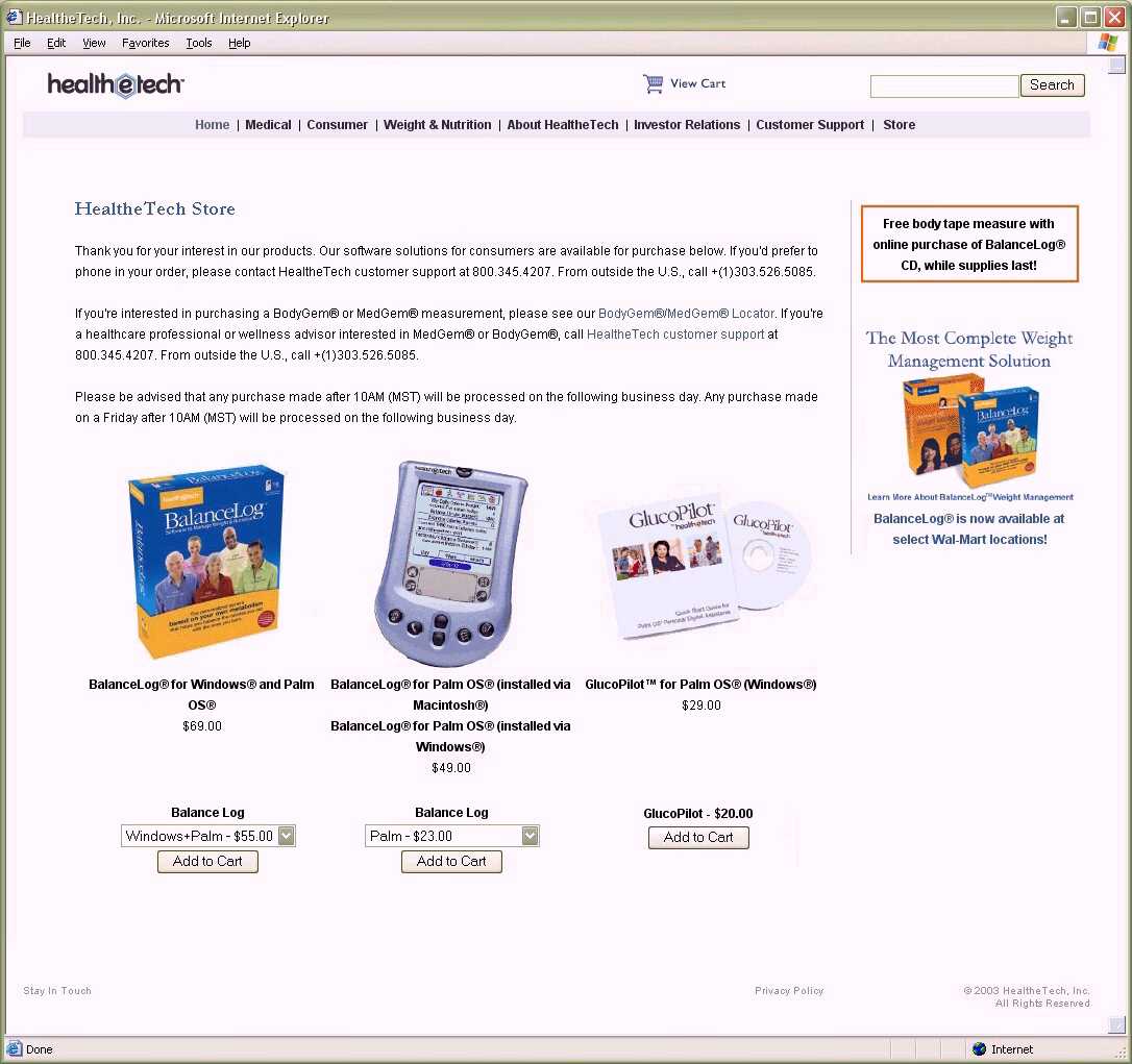
New store page. Kept as a
courtesy because there are a lot of links out there to the old store
page. Easy to figure out which product you want to buy. One click adds
it to your cart. Vertical branding piece advertises special offers (can
contain rotating content). No more pages of download time information. |